Lecture 5: Modern Theories — Heckscher-Ohlin & Lewis

Econ 2203 | International Trade and Policy in Agriculture

Nithin M

Department of Development Economics

2026-05-23

Recap: The Missing Piece in Ricardo

Last lecture: Comparative advantage — trade is driven by relative opportunity costs.

What Ricardo established: India has lower opportunity cost in Rice → exports Rice; World has lower opportunity cost in Wheat → exports Wheat; both gain from specialisation and trade.

What Ricardo left unanswered:

Why do opportunity costs differ across countries in the first place?

The Heckscher-Ohlin answer: Opportunity costs differ because countries differ in their endowments of factors of production (labour \(L\), capital \(K\), land \(T\)). And goods differ in factor intensity — how much of each factor they require.

The Heckscher-Ohlin Framework

The H-O model is the workhorse of international trade theory. It explains why comparative advantages arise from factor abundance.

Setup: Two countries (India \(I\), USA \(U\)), two goods (Rice \(R\), Machines \(M\)), two factors (Labour \(L\), Capital \(K\)); identical technologies across countries.

Factor intensity: Rice is labour-intensive relative to Machines if: \[\left(\frac{K}{L}\right)_R < \left(\frac{K}{L}\right)_M\]

Factor abundance (physical definition): India is labour-abundant if: \[\left(\frac{K}{L}\right)^I < \left(\frac{K}{L}\right)^U\]

Factor abundance (price definition): \[\left(\frac{w}{r}\right)^I < \left(\frac{w}{r}\right)^U \qquad \text{(labour is relatively cheaper in India)}\]

Assumptions of the H-O Model

Assumption Role in the model
2 countries, 2 goods, 2 factors (2×2×2) Tractable analytical framework
Identical technologies across countries Comparative advantage comes only from endowments
Different factor endowments This is the sole source of trade
Constant returns to scale Concave PPF; no scale effects
Perfect competition Prices equal marginal costs; zero profits
Factors mobile within countries Labour/capital shift freely between sectors
Factors immobile across countries No international migration or capital flows
No transport costs or trade barriers Goods prices equalise across countries
Incomplete specialisation Both goods produced in both countries
Identical, homothetic preferences Demand differences cannot explain trade

H-O Theorem: Formal Statement

Theorem (Heckscher 1919; Ohlin 1933):

A country exports the good that uses its abundant factor intensively.

Applied to India and USA:

\[\left(\frac{K}{L}\right)^I < \left(\frac{K}{L}\right)^U \quad \text{(India is labour-abundant)}\]

\[\left(\frac{K}{L}\right)_R < \left(\frac{K}{L}\right)_M \quad \text{(Rice is labour-intensive)}\]

\[\therefore \quad \text{India exports Rice; USA exports Machines}\]

Intuition: Labour-abundant India faces a low relative wage \(\Rightarrow\) labour-intensive Rice is relatively cheaper to produce there.

In autarky, India’s abundant labour \(\Rightarrow\) low \(w/r\) \(\Rightarrow\) low relative price of Rice:

\[\left(\frac{P_R}{P_M}\right)^I_{\text{autarky}} < \left(\frac{P_R}{P_M}\right)^U_{\text{autarky}}\]

Opening to trade raises \(P_R/P_M\) in India — India’s Rice sector expands, Machines sector contracts.

The Edgeworth Box: Factor Allocation

The Edgeworth box shows all efficient ways to allocate \(\bar{L}\) and \(\bar{K}\) between two sectors.

  • Origin \(O_R\): Rice sector
  • Origin \(O_M\): Machines sector (rotated 180°)
  • Contract curve: locus of tangencies of Rice and Machine isoquants \[\frac{MPL_R}{MPK_R} = \frac{MPL_M}{MPK_M}\]
  • All efficient allocations lie on the contract curve
  • The contract curve bows toward the labour axis (Rice is labour-intensive)
Show R code
library(ggplot2)

# Box: total Labour = 100, total Capital = 60
# Rice:     Q_R = L_R^0.6 * K_R^0.4  (labour-intensive)
# Machines: Q_M = L_M^0.4 * K_M^0.6  (capital-intensive)
# Contract curve from MRTS_R = MRTS_M:
#   (0.6/0.4)*(K_R/L_R) = (0.4/0.6)*(K_M/L_M)
#   =>  K_R = 240*L_R / (900 - 5*L_R)
L_cc <- seq(1, 99, by = 0.5)
K_cc <- 240 * L_cc / (900 - 5 * L_cc)

# Point E at L_R = 70: visually centred (70% of L-axis, ~51% of K-axis)
L_E <- 70
K_E <- 240 * L_E / (900 - 5 * L_E)   # = 16800/550 ≈ 30.5

# Rice isoquant through E
Q_R_E <- L_E^0.6 * K_E^0.4
iL_R  <- seq(45, 97, by = 0.5)
iK_R  <- (Q_R_E / iL_R^0.6)^(1 / 0.4)
df_R  <- subset(data.frame(L = iL_R, K = iK_R), K >= 0 & K <= 60)

# Machines isoquant through E (drawn in original coords)
# E in machine coords: L_M = 30, K_M ≈ 29.5
Q_M_E <- (100 - L_E)^0.4 * (60 - K_E)^0.6
iLM   <- seq(11, 99, by = 0.5)
iKM   <- (Q_M_E / iLM^0.4)^(1 / 0.6)
df_M  <- subset(data.frame(L = 100 - iLM, K = 60 - iKM),
                K >= 0 & K <= 60 & L >= 0 & L <= 100)

ggplot() +
  annotate("rect", xmin = 0, xmax = 100, ymin = 0, ymax = 60,
           fill = "#f8f8f8", color = "black", linewidth = 1.1) +
  # Isoquants
  geom_line(data = df_R, aes(x = L, y = K),
            color = "#012169", linewidth = 0.9, linetype = "dashed") +
  geom_line(data = df_M, aes(x = L, y = K),
            color = "#B9975B", linewidth = 0.9, linetype = "dashed") +
  # Contract curve
  geom_line(data = data.frame(L = L_cc, K = K_cc), aes(x = L, y = K),
            color = "#012169", linewidth = 1.6) +
  # Efficient allocation E
  geom_point(aes(x = L_E, y = K_E), size = 4, color = "darkgreen") +
  annotate("text", x = 74, y = 33, hjust = 0, size = 3.5,
           label = "E  (efficient alloc.)", color = "darkgreen") +
  # Rice origin
  annotate("text", x = 2, y = 2.5, hjust = 0, size = 4, fontface = "bold",
           label = "O[R]", parse = TRUE, color = "#012169") +
  annotate("text", x = 2, y = 7.5, hjust = 0, size = 3,
           label = "Rice sector", color = "#012169") +
  # Machines origin
  annotate("text", x = 98, y = 57.5, hjust = 1, size = 4, fontface = "bold",
           label = "O[M]", parse = TRUE, color = "#B9975B") +
  annotate("text", x = 98, y = 52.5, hjust = 1, size = 3,
           label = "Machines sector", color = "#B9975B") +
  # Isoquant labels
  annotate("text", x = 82, y = 3, hjust = 0, size = 3,
           label = "Rice isoquant", color = "#012169") +
  annotate("text", x = 5, y = 50, hjust = 0, size = 3,
           label = "Machines\nisoquant", color = "#B9975B") +
  # Contract curve label
  annotate("text", x = 42, y = 26, hjust = 0, size = 3.5, fontface = "bold",
           label = "Contract\ncurve", color = "#012169") +
  labs(
    title    = "Edgeworth box: efficient factor allocations",
    subtitle = expression(paste("At E: ", MPL[R]/MPK[R], " = ", MPL[M]/MPK[M])),
    x        = "Labour allocated to Rice",
    y        = "Capital allocated to Rice"
  ) +
  coord_cartesian(xlim = c(-2, 103), ylim = c(-4, 62)) +
  theme_minimal(base_size = 11)
Figure 1: Edgeworth Box: Efficient Factor Allocation Between Rice and Machines Source: Author’s illustration.

From Edgeworth Box to PPF

The Production Possibility Frontier is derived from the contract curve:

Key insight:

  • Every point on the contract curve corresponds to a point on the PPF
  • Moving along the contract curve (reallocating factors) traces out the PPF
  • The slope of the PPF at any point equals the negative of the relative price \(P_R/P_M\)

Factor intensity and PPF shape:

Because Rice is labour-intensive: - Moving labour from Machines → Rice: output of Rice rises fast (labour goes to its intensive use) - PPF is concave (bowed outward) — increasing opportunity costs

\[\frac{d^2 R}{d M^2} < 0\]

In the Ricardian model, constant labour requirements → linear PPF. H-O gives a curved PPF.

Illustrative PPFs:

Show R code
library(ggplot2)

M_seq <- seq(0, 100, by=1)
R_HO  <- 200 * sqrt(1 - (M_seq/100)^2)  # concave (H-O)
R_Ric <- 200 - 2*M_seq                    # linear (Ricardo)
R_Ric <- pmax(0, R_Ric)

df_ppf2 <- data.frame(
  M = c(M_seq, M_seq),
  R = c(R_HO, R_Ric),
  model = rep(c("H-O (concave)", "Ricardo (linear)"), each=101)
)

ggplot(df_ppf2, aes(x=M, y=R, color=model, linetype=model)) +
  geom_line(linewidth=1.3) +
  scale_color_manual(values=c("H-O (concave)"="#012169",
                               "Ricardo (linear)"="#B9975B")) +
  labs(title="PPF Shape: H-O vs Ricardo",
       x="Machines", y="Rice", color=NULL, linetype=NULL) +
  theme_minimal(base_size=10) +
  theme(legend.position="bottom")

Basis for and Gains from Trade: H-O Model

  • India (labor-abundant) exports Rice; USA (capital-abundant) exports Machines; both reach higher IC
  • Production: A/A* → B/B* along PPF; consumption: A/A* → E/E* on trade line (above PPF)
Show R code
library(ggplot2)
library(patchwork)

# Shared theme
th <- theme_minimal(base_size = 9) +
  theme(panel.grid.minor = element_blank(),
        plot.title = element_text(hjust = 0.5, face = "bold", size = 9.5),
        axis.title = element_text(size = 8),
        plot.margin = margin(4, 8, 4, 4))

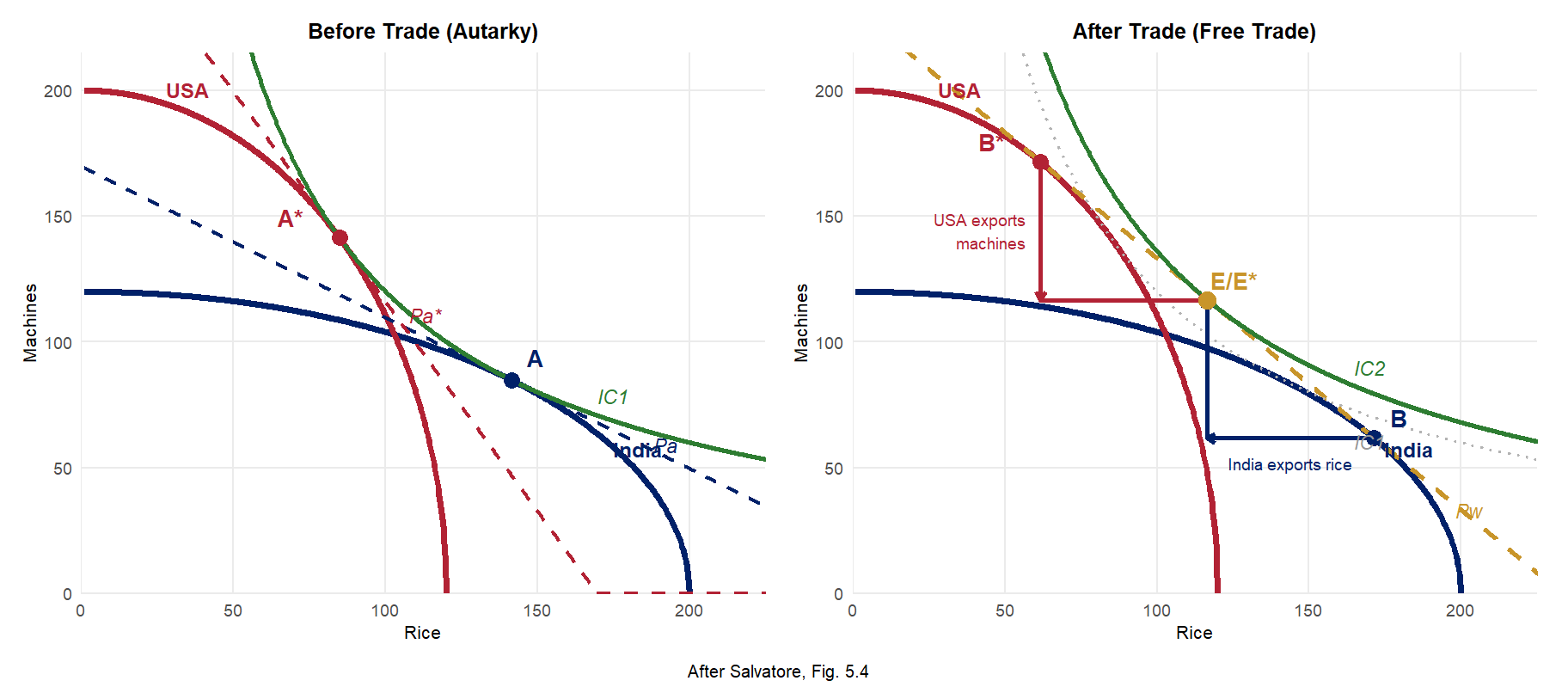
# ── Coordinates (X = Rice, Y = Machines; Salvatore Fig. 5.4 convention)
# India PPF: M = 120√(1-(R/200)²), Pa slope = -0.6
# USA   PPF: M = 200√(1-(R/120)²), Pa* slope = -5/3; Pw = -1
# U = R*M: IC1 (U=12000) tangent to Pa at A AND Pa* at A* (same curve!)
#          IC2 (U=13596) tangent to Pw at E = E* (same point, by symmetry)

A_R  <- 200 / sqrt(2)           # India autarky A  ≈ (141.4,  84.9)
A_M  <- 120 / sqrt(2)
B_R  <- sqrt(14400 / 0.4896)    # India production B ≈ (171.5,  61.7)
B_M  <- 0.36 * B_R
Pw_c <- B_R + B_M               # Pw intercept ≈ 233.2
E_R  <- Pw_c / 2                # Shared consumption E = E* ≈ (116.6, 116.6)
E_M  <- Pw_c / 2
U1   <- A_R * A_M               # IC1 ≈ 12000
U2   <- E_R * E_M               # IC2 ≈ 13596

As_R <- A_M;  As_M <- A_R      # USA autarky A*  ≈ ( 84.9, 141.4)
Bs_R <- B_M;  Bs_M <- B_R      # USA production B* ≈ ( 61.7, 171.5)

rg <- seq(1, 230, len = 900)   # shared R grid

# Both panels share the same axes and both PPFs
india_ppf <- geom_line(
  data = data.frame(R = seq(1,200,len=500), M = 120*sqrt(1-(seq(1,200,len=500)/200)^2)),
  aes(R, M), color = "#012169", linewidth = 1.4)
usa_ppf <- geom_line(
  data = data.frame(R = seq(1,120,len=500), M = 200*sqrt(1-(seq(1,120,len=500)/120)^2)),
  aes(R, M), color = "#B22234", linewidth = 1.4)

# ── Panel 1: Before Trade (Autarky) ───────────────────────────────────────────
p1 <- ggplot() +
  india_ppf + usa_ppf +
  # Pa (India, slope -0.6, tangent at A)
  geom_line(data = data.frame(R=rg, M=pmax(0, A_M + 0.6*(A_R - rg))),
            aes(R,M), color="#012169", linewidth=0.85, linetype="dashed") +
  # Pa* (USA, slope -5/3, tangent at A*)
  geom_line(data = data.frame(R=rg, M=pmax(0, As_M + (5/3)*(As_R - rg))),
            aes(R,M), color="#B22234", linewidth=0.85, linetype="dashed") +
  # IC1 — same hyperbola tangent to Pa at A and Pa* at A*
  geom_line(data = data.frame(R=rg, M=U1/rg), aes(R,M),
            color="#2E7D32", linewidth=0.95) +
  # Key points
  geom_point(aes(A_R,  A_M),  color="#012169", size=3.0, shape=16) +
  geom_point(aes(As_R, As_M), color="#B22234", size=3.0, shape=16) +
  # Point labels
  annotate("text", x=A_R+8,   y=A_M+9,  label="A",  fontface="bold", size=3.5, color="#012169") +
  annotate("text", x=As_R-16, y=As_M+8, label="A*", fontface="bold", size=3.5, color="#B22234") +
  # Price line labels
  annotate("text", x=196, y=A_M+0.6*(A_R-196)+7,
           label="Pa",  size=3.0, color="#012169", hjust=1, fontface="italic") +
  annotate("text", x=108, y=As_M+(5/3)*(As_R-108)+8,
           label="Pa*", size=3.0, color="#B22234", hjust=0, fontface="italic") +
  annotate("text", x=175, y=U1/175+10, label="IC1", size=3.0, color="#2E7D32", fontface="italic") +
  # Country PPF labels
  annotate("text", x=183, y=120*sqrt(1-(183/200)^2)+9,
           label="India", size=3.2, color="#012169", fontface="bold") +
  annotate("text", x=35,  y=200*sqrt(1-(35/120)^2)+9,
           label="USA",   size=3.2, color="#B22234",  fontface="bold") +
  scale_x_continuous(expand=c(0,0)) + scale_y_continuous(expand=c(0,0)) +
  coord_cartesian(xlim=c(0,225), ylim=c(0,215)) +
  labs(title="Before Trade (Autarky)", x="Rice", y="Machines") + th

# ── Panel 2: After Trade (Free Trade) ─────────────────────────────────────────
p2 <- ggplot() +
  india_ppf + usa_ppf +
  # Pw (slope -1, shared world price through B, B*, E)
  geom_line(data = data.frame(R=rg, M=pmax(0, Pw_c - rg)), aes(R,M),
            color="#C8952A", linewidth=1.0, linetype="dashed") +
  # IC1 (faint reference)
  geom_line(data = data.frame(R=rg, M=U1/rg), aes(R,M),
            color="grey70", linewidth=0.7, linetype="dotted") +
  # IC2 — tangent to Pw at E (= E*)
  geom_line(data = data.frame(R=rg, M=U2/rg), aes(R,M),
            color="#2E7D32", linewidth=0.95) +
  # Trade triangle: India (blue) B → (E_R, B_M) → E
  annotate("segment", x=B_R, xend=E_R, y=B_M, yend=B_M,
           color="#012169", linewidth=0.9, arrow=arrow(length=unit(0.14,"cm"), ends="last")) +
  annotate("segment", x=E_R, xend=E_R, y=B_M, yend=E_M,
           color="#012169", linewidth=0.9, arrow=arrow(length=unit(0.14,"cm"), ends="last")) +
  # Trade triangle: USA (red) B* → (Bs_R, E_M) → E*
  annotate("segment", x=Bs_R, xend=Bs_R, y=Bs_M, yend=E_M,
           color="#B22234", linewidth=0.9, arrow=arrow(length=unit(0.14,"cm"), ends="last")) +
  annotate("segment", x=Bs_R, xend=E_R, y=E_M, yend=E_M,
           color="#B22234", linewidth=0.9, arrow=arrow(length=unit(0.14,"cm"), ends="last")) +
  # Key points
  geom_point(aes(B_R,  B_M),  color="#012169", size=3.0, shape=16) +
  geom_point(aes(Bs_R, Bs_M), color="#B22234", size=3.0, shape=16) +
  geom_point(aes(E_R,  E_M),  color="#C8952A", size=3.5, shape=16) +
  # Point labels
  annotate("text", x=B_R+8,   y=B_M+8,  label="B",    fontface="bold", size=3.5, color="#012169") +
  annotate("text", x=Bs_R-16, y=Bs_M+8, label="B*",   fontface="bold", size=3.5, color="#B22234") +
  annotate("text", x=E_R+9,   y=E_M+8,  label="E/E*", fontface="bold", size=3.5, color="#C8952A") +
  # Price / IC labels
  annotate("text", x=207, y=Pw_c-207+7,  label="Pw",  size=3.0, color="#C8952A", hjust=1, fontface="italic") +
  annotate("text", x=170, y=U2/170+10,   label="IC2", size=3.0, color="#2E7D32", fontface="italic") +
  annotate("text", x=170, y=U1/170-10,   label="IC1", size=3.0, color="grey60",  fontface="italic") +
  # Trade flow labels
  annotate("text", x=(B_R+E_R)/2, y=B_M-10,
           label="India exports rice", size=2.5, hjust=0.5, color="#012169") +
  annotate("text", x=Bs_R-5, y=(Bs_M+E_M)/2,
           label="USA exports\nmachines", size=2.5, hjust=1, color="#B22234") +
  # Country PPF labels
  annotate("text", x=183, y=120*sqrt(1-(183/200)^2)+9,
           label="India", size=3.2, color="#012169", fontface="bold") +
  annotate("text", x=35,  y=200*sqrt(1-(35/120)^2)+9,
           label="USA",   size=3.2, color="#B22234",  fontface="bold") +
  scale_x_continuous(expand=c(0,0)) + scale_y_continuous(expand=c(0,0)) +
  coord_cartesian(xlim=c(0,225), ylim=c(0,215)) +
  labs(title="After Trade (Free Trade)", x="Rice", y="Machines") + th

# ── Combine ────────────────────────────────────────────────────────────────────
p1 + p2 +
  plot_annotation(
    caption = "After Salvatore, Fig. 5.4",
    theme = theme(plot.caption = element_text(hjust = 0.5, size = 7.5))
  )

Figure 2: Basis for and Gains from Trade: H-O Model (after Salvatore, Fig. 5.4)

Theorem 1: Factor Price Equalisation (FPE)

Theorem (Samuelson 1948):

Under H-O assumptions, free trade in goods completely equalises factor prices across countries — even without factor mobility:

\[w^I = w^U \qquad \text{(wages equalise)}\] \[r^I = r^U \qquad \text{(returns to capital equalise)}\]

Intuition:

  • Trade in goods is an indirect form of trading factors
  • India exporting Rice is equivalent to exporting embedded labour
  • As India expands Rice production, labour demand rises → Indian wages rise
  • As USA imports Rice, labour demand in USA Rice sector falls → US wages fall
  • In equilibrium: \(w^I = w^U\)

The FPE insight

Free trade is a perfect substitute for factor mobility. This explains why labour migration and goods trade are strategic complements in policy debates.

FPE: Assumptions and Critique

FPE requires very strong assumptions:

Assumption Status in reality
Identical technologies Violated (TFP gaps are large)
Free trade in all goods Violated (tariffs, NTBs)
No factor intensity reversal Usually holds
Incomplete specialisation Often violated
No transport costs Violated

Theorem 2: Stolper-Samuelson Theorem

Theorem (Stolper and Samuelson 1941):

A rise in the relative price of a good raises the real return to the factor used intensively in that good’s production, and lowers the real return to the other factor — more than proportionally:

\[\hat{P}_R > 0 \Rightarrow \hat{w} > \hat{P}_R > 0 > \hat{r}\]

where \(\hat{x} \equiv d\ln x\) denotes percentage change, and Rice is labour-intensive.

Formal result:

\[\hat{w} > \hat{P}_R > \hat{P}_M > \hat{r}\]

This is the magnification effect: factor price changes are magnified relative to goods price changes.

Applied to India opening to trade:

\[P_R \uparrow \Rightarrow w \uparrow\uparrow, \quad r \downarrow \quad \text{(Indian workers gain; Indian capital owners lose)}\]

\[P_M \uparrow \Rightarrow r \uparrow\uparrow, \quad w \downarrow \quad \text{(US capital owners gain; US workers lose → political economy of protectionism!)}\]

Stolper-Samuelson: Policy Relevance

Why does Stolper-Samuelson matter for policy?

It explains who lobbies for and against trade liberalisation:

  • Labour in labour-abundant countries → pro-trade
  • Capital in labour-abundant countries → anti-trade (or sector-specific)
  • Labour in capital-abundant countries → anti-trade (e.g., US manufacturing unions)

India’s agricultural trade policy: When India raises rice export prices via MSP increases: \(P_R \uparrow \Rightarrow w_{\text{agri}} \uparrow \Rightarrow\) rural wages rise — Stolper-Samuelson in action.

The compensation principle: Even when aggregate welfare rises, there are distributional losers. A country could use the gains to compensate losers, but in practice: compensation schemes are costly, political constraints prevent redistribution, short-run adjustment costs fall unevenly. This is why trade adjustment assistance (TAA) programs exist.

Theorem 3: Rybczynski Theorem

Theorem (Rybczynski 1955):

At constant goods prices, an increase in the endowment of a factor causes:

\[L \uparrow \Rightarrow Q_R \uparrow\uparrow \text{ and } Q_M \downarrow\]

More precisely:

\[\hat{Q}_R > \hat{L} > 0 > \hat{Q}_M\]

  • Output of the labour-intensive good rises more than proportionally to the labour increase
  • Output of the capital-intensive good falls absolutely

Intuition: Expanding Rice output (to absorb new labour) requires withdrawing capital from Machines, even though capital endowment is unchanged. At constant prices, the only way to re-equate factor ratios is to pull capital into Rice and contract Machines.

India application: India’s rural-to-urban migration (labour inflow to manufacturing): \[L_{\text{mfg}} \uparrow \Rightarrow Q_{\text{mfg}} \uparrow\uparrow, \quad Q_{\text{agri}} \downarrow\] Structural transformation is partly a Rybczynski phenomenon.

Rybczynski Effect: PPF Diagram

An inflow of labour rotates the PPF outward, but asymmetrically:

  • The Rice (labour-intensive) intercept expands greatly
  • The Machines (capital-intensive) intercept contracts

At the original price ratio, the economy moves from A to B:

  • More Rice produced (\(Q_R \uparrow\uparrow\))
  • Fewer Machines (\(Q_M \downarrow\))

This is the Rybczynski line — locus of output combinations at constant prices as labour endowment varies.

Show R code
library(ggplot2)

M_seq       <- seq(0, 110, by=1)
rice_before <- pmax(0, 200 * sqrt(pmax(0, 1 - (M_seq/100)^2)))
rice_after  <- pmax(0, 260 * sqrt(pmax(0, 1 - (M_seq/88)^2)))

df_ryb <- data.frame(
  M    = c(M_seq, M_seq),
  Rice = c(rice_before, rice_after),
  period = rep(c("Before labour inflow (L=100)",
                 "After labour inflow (L=130)"), each=length(M_seq))
)

ggplot(df_ryb, aes(x=M, y=Rice, color=period, linetype=period)) +
  geom_line(linewidth=1.5) +
  # Price line (slope = constant P_R/P_M)
  geom_abline(slope=-1.8, intercept=162, color="grey60",
              linetype="dotted", linewidth=0.8) +
  # Point A (before)
  geom_point(aes(x=45, y=100), inherit.aes=FALSE,
             color="#012169", size=4) +
  annotate("text", x=48, y=100, label="A (before)",
           hjust=0, size=3.2, color="#012169") +
  # Point B (after) — same price line, more Rice, less M
  geom_point(aes(x=30, y=136), inherit.aes=FALSE,
             color="#B9975B", size=4) +
  annotate("text", x=33, y=136, label="B (after)\nRice↑, Mach↓",
           hjust=0, size=3.2, color="#B9975B") +
  annotate("segment", x=45, y=100, xend=30, yend=136,
           arrow=arrow(length=unit(0.25,"cm")),
           color="darkgreen", linewidth=1) +
  annotate("text", x=22, y=115,
           label="Rybczynski\neffect", color="darkgreen",
           size=3.5, hjust=0.5, fontface="bold") +
  scale_color_manual(values=c(
    "Before labour inflow (L=100)"="#012169",
    "After labour inflow (L=130)" ="#B9975B")) +
  scale_linetype_manual(values=c(
    "Before labour inflow (L=100)"="solid",
    "After labour inflow (L=130)" ="dashed")) +
  labs(title="Labour inflow expands Rice output and contracts Machines",
       subtitle="At constant goods prices — pure Rybczynski movement",
       x="Machines", y="Rice", color=NULL, linetype=NULL) +
  theme_minimal(base_size=11) +
  theme(legend.position="bottom")
Figure 3: Rybczynski Effect: Labour Inflow Shifts PPF Source: Author’s illustration.

The Leontief Paradox (1953)

The test: Wassily Leontief (1953) used US input-output tables to measure the capital and labour content of US exports and imports.

The prediction (H-O): The USA, being capital-abundant, should export capital-intensive goods and import labour-intensive goods.

The finding: US exports were more labour-intensive than US imports — the opposite of H-O!

Formal statement of the paradox:

\[\left(\frac{K}{L}\right)_{\text{US exports}} < \left(\frac{K}{L}\right)_{\text{US imports}}\]

This contradicts the basic H-O prediction for a capital-abundant country.

Factor Intensity of India’s Trade

Show R code
library(ggplot2)

df_leo <- data.frame(
  category = c("Agricultural\nExports", "Textile\nExports",
                "Pharma\nExports", "Capital Goods\nImports",
                "Electronics\nImports", "Crude Oil\nImports"),
  KL_ratio = c(0.8, 1.2, 2.1, 7.1, 6.3, 8.5),
  type = c("Exports","Exports","Exports","Imports","Imports","Imports")
)
df_leo$category <- factor(df_leo$category,
                           levels=df_leo$category[order(df_leo$KL_ratio)])

ggplot(df_leo, aes(x=category, y=KL_ratio, fill=type)) +
  geom_col(width=0.7) +
  scale_fill_manual(values=c("Exports"="#012169", "Imports"="#B9975B")) +
  coord_flip() +
  labs(title="India: Capital-Labour Ratios in Export vs Import Industries",
       subtitle="India exports labour-intensive goods — consistent with H-O",
       x=NULL, y="Capital-Labour Ratio (relative units)", fill=NULL) +
  theme_minimal(base_size=11) +
  theme(legend.position="bottom")

Figure 4: Factor Intensity of India’s Exports vs Imports (illustrative) Source: Author’s illustration based on DGCI&S / World Bank data.

India does NOT exhibit a Leontief paradox — it exports labour-intensive goods, consistent with H-O.

Explanations for the Leontief Paradox

Several resolutions have been proposed:

  1. Human capital: US labour is highly skilled — skill-adjusted, US workers embody large amounts of human capital (\(\text{Effective } K/L = (K + K_H)/L\))
  2. Factor intensity reversals: Same good can be labour-intensive in one country and capital-intensive in another (different factor prices → different techniques)
  3. Natural resource abundance: US imports include oil and raw materials — these are capital-intensive; excluding natural resource industries resolves much of the paradox
  4. Demand bias: US consumers have stronger preference for capital-intensive goods; demand effects can offset supply-side comparative advantage
  5. Trade barriers: US tariff structure historically protected labour-intensive industries (agriculture, textiles), distorting trade flows

Lewis (1954): Structural Transformation

While H-O focuses on between-country differences, the Lewis model explains how factor endowments evolve within a developing country:

Two sectors: Traditional sector (agriculture) with large labour surplus (\(MPL_A \approx 0\)); Modern sector (industry/services) with higher wages.

Lewis’s key assumption: \(MPL_A < \bar{w}_{\text{subsistence}}\) — a pool of “surplus labour” in agriculture can be absorbed by industry without raising agricultural wages.

Implications for agricultural trade during Lewis transition:

  • Low rural wages → comparative advantage in labour-intensive agricultural exports
  • As industrialisation proceeds → rural wages rise → agricultural comparative advantage erodes
  • Eventually: Rybczynski-type shift away from agricultural exports

East Asia’s trajectory: Japan (1950s–70s) → South Korea (1970s–90s) → China (2000s–) each followed this path: strong agricultural/labour-intensive exports early, shifting to capital-intensive manufactures.

Lewis Model: Diagrammatic Analysis

Show R code
library(ggplot2)
library(patchwork)

# Agriculture: flat MPL (surplus labour) then rising
L_agri <- seq(0, 100, by=1)
MPL_agri <- ifelse(L_agri <= 60, 0.5, 0.5 + 0.08*(L_agri - 60))
subsistence <- rep(1.5, 101)

p_agri <- ggplot(data.frame(L=L_agri, MPL=MPL_agri, sub=subsistence)) +
  geom_line(aes(x=L, y=MPL), color="#012169", linewidth=1.5) +
  geom_line(aes(x=L, y=sub), color="red", linewidth=1, linetype="dashed") +
  geom_vline(xintercept=60, linetype="dotted", color="grey50") +
  annotate("text", x=62, y=1.0,
           label="Turning\npoint", size=3, color="grey40", hjust=0) +
  annotate("text", x=10, y=1.65,
           label="Subsistence wage", color="red", size=3) +
  annotate("rect", xmin=0, xmax=60, ymin=0, ymax=0.5,
           alpha=0.15, fill="#012169") +
  annotate("text", x=30, y=0.25,
           label="Surplus\nlabour", size=3, color="#012169", hjust=0.5) +
  labs(title="Agriculture",
       x="Labour in Agriculture", y="Marginal Product of Labour") +
  theme_minimal(base_size=10) +
  ylim(0, 2.5)

# Industry: upward-sloping demand for labour
L_ind <- seq(0, 80, by=1)
MPL_ind0 <- 4.0 - 0.03*L_ind   # initial
MPL_ind1 <- 5.5 - 0.03*L_ind   # after capital accumulation

p_ind <- ggplot() +
  geom_line(data=data.frame(L=L_ind, MPL=MPL_ind0),
            aes(x=L, y=MPL), color="#B9975B", linewidth=1.5) +
  geom_line(data=data.frame(L=L_ind, MPL=MPL_ind1),
            aes(x=L, y=MPL), color="#B9975B", linewidth=1.5, linetype="dashed") +
  geom_hline(yintercept=1.5, color="red", linetype="dashed", linewidth=1) +
  annotate("segment", x=83, y=2.0, xend=83, yend=3.5,
           arrow=arrow(length=unit(0.2,"cm")),
           color="darkgreen", linewidth=0.8) +
  annotate("text", x=84, y=2.75, label="Capital\naccum.", size=3,
           color="darkgreen", hjust=0) +
  geom_point(aes(x=(4.0-1.5)/0.03, y=1.5), size=3.5, color="#B9975B") +
  geom_point(aes(x=(5.5-1.5)/0.03, y=1.5), size=3.5, color="#B9975B") +
  annotate("text", x=(4.0-1.5)/0.03 + 2, y=1.3,
           label="L1", size=3) +
  annotate("text", x=(5.5-1.5)/0.03 + 2, y=1.3,
           label="L2", size=3) +
  labs(title="Industry",
       x="Labour in Industry", y="Marginal Product of Labour") +
  theme_minimal(base_size=10) +
  ylim(0, 5.5)

p_agri + p_ind

Figure 5: Lewis Model: Surplus Labour Transfer and Structural Transformation Source: Author’s illustration after Lewis (1954).

H-O, Lewis, and India’s Agricultural Exports

Connecting the models:

Mechanism H-O Lewis
Source of CA Factor endowments Wage dualism
Key variable \(K/L\) ratio \(MPL_A\) vs \(\bar{w}\)
Trade prediction Export labour-intensive goods Export goods with surplus-labour content
Dynamics Static Dynamic (transition)

Combined implication for India: India currently sits at an early Lewis stage — large agricultural labour surplus (~40% of workforce); low rural wages → comparative advantage in labour-intensive agri exports.

India’s agricultural export performance (FY2024): Total $43.7B; Rice $10.4B; Marine $7.6B; Spices $3.7B — H-O predicts labour-intensive crops dominate (confirmed); Lewis explains low rural wages underpin price competitiveness.

India should invest in agricultural productivity to maintain competitiveness even as wages rise — moving up the value chain rather than defending low-wage advantage.

The Modern Theory of Trade: Summary

Three pillars of the H-O framework:

  1. H-O Theorem: countries export goods intensive in their abundant factor
  2. Factor Price Equalisation: \(w^I = w^U\), \(r^I = r^U\) (free trade substitutes for factor mobility)
  3. Stolper-Samuelson: \(\hat{P}_R > 0 \Rightarrow \hat{w} > \hat{P}_R > 0 > \hat{r}\) (trade has stark distributional effects)
  4. Rybczynski: \(\hat{L} > 0 \Rightarrow \hat{Q}_R > \hat{L} > 0 > \hat{Q}_M\) (factor accumulation biases production)

Empirical evidence: Factor content of trade is mixed (Trefler 1995); India’s labour-intensive export pattern is confirmed; wage convergence is partial (direction correct); Stolper-Samuelson distributional effects are strong in the long run; Rybczynski structural change is well-supported by East Asian data.

What H-O cannot explain: Intra-industry trade; trade between similar countries; scale economies → New Trade Theory (Lecture 6)

Looking Ahead: New Trade Theory

Why do we need a theory beyond H-O?

  • \(\approx 60\%\) of world trade is intra-industry (exchanging similar goods)
  • Large share of trade is between similar, high-income countries
  • Scale economies matter — firms, not just countries, have comparative advantages

Krugman’s (1979) insight:

Even with identical factor endowments, countries gain from trade because:

\[\text{Specialisation} \Rightarrow \text{Scale economies} \Rightarrow \text{Lower costs} \Rightarrow \text{More variety}\]

Each country specialises in a different variety of the same good — gains arise from love of variety, not factor endowments.

Next lecture: Economies of scale, monopolistic competition, and the new economic geography — why do trade and production cluster? And what does this mean for India’s agricultural processing sector?

Appendix

Additional Resources

Further Reading

  • International Economics — Salvatore (Ch. 4-5)
  • International Economics — Appleyard & Field (Ch. 4-5)
  • RBI/DGCI&S/APEDA databases for latest data

Key Data Sources

  • DGCI&S: India’s merchandise trade
  • RBI: Balance of payments data
  • APEDA: Agricultural export statistics
  • WTO: Tariff and trade databases